

My last "Truth of Clouds" post attracted a question which related to the times when there is no sunlight in the sky; whether then, it is still appropriate to paint with pinks, lavendars and golds as I showed in my example picture. Here it is again, in case you did not see the post.
We have to remember that whether we can see it or not, the sun is the source of all light. The sun wields a pretty nifty paintbrush too. If it was not there at all, there would be no light, no colour. I am aware that some days, the sky seems blanketed with a layer of monotonous white and grey, so the sun does not seem to be doing much of a job with her paintbrush...but that begs another question - answer in italics in the next paragraph!
Let's think about storm or rain clouds....you could paint them dark grey, medium grey and light grey...but wouldn't that be a bit boring and monotonous? Would those colours convey your true impression of the scene? If the scene is really colourless and monotonous, why paint it at all?
But if the scene excites you, why would you not use coloured greys? Why shouldn't the entire scene have a particular colour bias? You are an artist, not a camera, so you can choose how to depict your scene. Storm clouds, for instance, certainly need not just be grey - they can, and often do, contain hints of brown, ochre, indigo, even purple and violet. Warm and cool greys. The tone should always be compared with what is happening with the landscape below - the lack of light can produce, for example, seas which are startlingly darker than the clouds.
The artist who posed the question said that he is conscious that when purples pinks yellows and violet are added to clouds, they "look nicer" - which is true, of course, but we artists need to beware of using any kind of formula for painting particular subjects. Not every tree trunk is brown, not every shadow is purple or violet, not all grasses are the same green. There does need to be some consideration for the atmosphere you want to depict, for the time of day, and what is actually happening visually. Those pinks and yellows would probably not be seen if there were heavy storm clouds around in the middle of the day, but might be seen if there was a tiny break in the heavy clouds, towards the sunset, for example. This is where observation is vital.
John Constable certainly knew his clouds and skies, he used to paint from his window EVERY DAY, watching the changing skies carefully - I hope this reproduction goes some way to show some of the subtle coloured greys he used:

And here is a wonderful photo of unusual storm clouds - there may be no "sunlight" but the light in the sky below the clouds must come from the sun, and that light has illuminated the BOTTOMS of the clouds, a unique effect....and look at the colours, the warms and cools.........:

Storm conditions often produce quite eerie lighting effects, I am sure you must have seen this - these are the elements of chance that the painter will rejoice in, because he then has the chance to depict something special.
The painter who loves nature should, in my humble opinion, try to find a way to show the audience something that moved her (or him):I always attempt to produce a visual image which for me, represents not just what I see, but also what I feel about the scene.....I live in the hope that my images will always be my own unique interpretation of the scene. I do not want to "be" like a camera, or copy photos slavishly. I cannot see the point in that. As an artist, I feel I HAVE to bring something else to the table. It is a long-term goal - maybe one day I will achieve it. In the meantime, I will keep on trying, and will try to encourage others too, to cherish the same ambition.
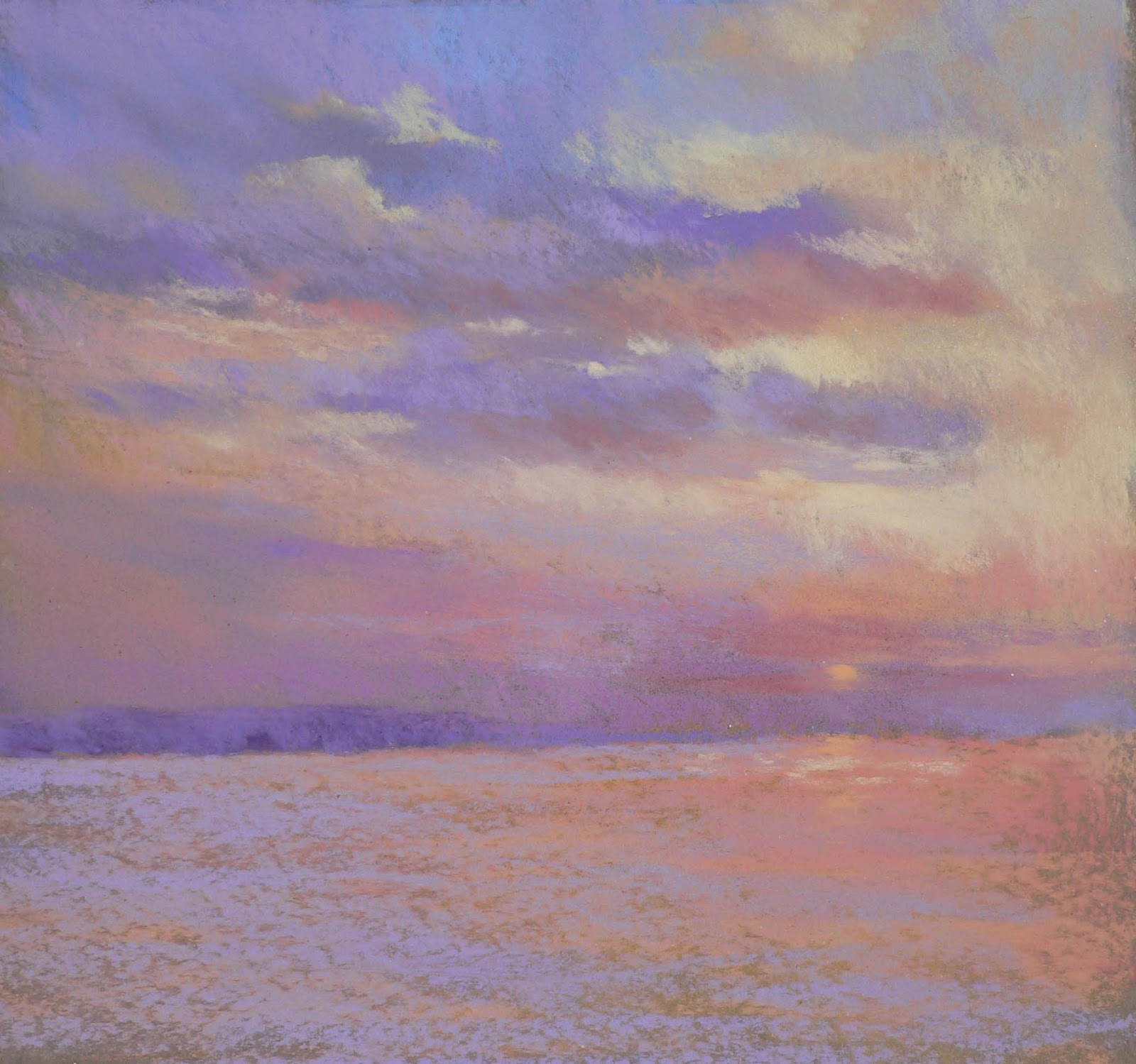 |
| Sunset over the Sea, Pastel on paper, Jackie Simmonds |
Jackie, why did your blog page print this way? a long verticle line of text, it made it very hard to read and enjoy- - and you are speaking of things I find very important and really want your view, experiance, thoughts, knowledge about painting skies, and clouds, and the feeling of the whole thing. This was a wonderful post, can you fix it?? I hope so. Thanks so much for your efforts and all the thought and time and work you put into this blog. Its great!
ReplyDeleteso sorry Ida but on my computer, it seems to have published ok. I will ask someone else to check it out tho. thanks for letting me know.
DeleteJackie,
ReplyDeleteI'm so happy someone sent me a link to your blog! Your skies are so full of life and color!
I've been painting sunrises and sunsets each day for a couple of months and blogging about them at www.jaimehowardart.blogspot.com. Also reading John Constable's Skies by Thornes. I'm happy to share "my" skies with you.
Jaime Howard
Jackie, I'm having the same problem as Ida, one long vertical line of letters, very strange. The rest of your blog looks fine, it's just the post of text after John Constable's painting and ends at your painting, Sunset over the Sea. Very weird. Great post on painting clouds, at least what I could read of it! I hope you can get it fixed. I'm thinking if you've saved the text somewhere on your computer maybe you could delete the post and re-post it again? That could be an easy fix if that's all it takes.
ReplyDeleteOne of the most interesting cloud colors I've seen, especially in the Midwest, is when reflected green from the ground gives a green cast to the clouds. It'll especially be on their undersides but on low stormy overcast days it can get very intense. There's also a hue of green clouds that's the color that means tornadoes are likely. I've only seen it once and I'm not entirely sure of it, but it was very strong. People talk about pea soup color on some of those days.
ReplyDeleteObserving the subtle colors in nature and then kicking them up a notch to make them more visible in pigment is one of the things I love doing. I think that more than anything is what keeps drawing me back to pastels.
your work is so wonderful, will come back for more tips.
ReplyDelete