Copying exactly what we see is a natural thing for an artist to do. But often, this leads to a simple duplication of reality. But there is more to painting that just copying. And one of the many things that can help you be more creative, more of an artist than a simple copyist, is to begin to see how you can simplify your subject matter into an arrangement of strong shapes within the rectangle. I can promise you that learning how important this business of "shapes within the rectangle" will stand you in SUCH good stead, it is really vital to producing interesting, strong, visually dynamic images.
Grouping and simplifying should be your aim, ideally.
Grouping and simplifying should be your aim, ideally.
A painting should be made up of large, medium, and small shapes - with the emphasis on the large, main shapes FIRST and foremost. If you spend too much time on the fiddly, tiny shapes, or if you begin with those small shapes, you will lose sight of the large, main shapes. This is the key to learning how to simplify and how to begin a painting.. BEGIN WITH THE BIG SHAPES. Squint like mad to try to group as many similar tones together, as possible.
Try to remember that you can create a bigger, more important shape by diminishing the importance of the way one shape sits alongside or touches its neighbour.....by softening an edge, or ensuring that the tone value of the adjoining shape is similar. This isn't always easy to see, but doing thumbnail sketches, and squinting, really does help.
Here is photo of a market porter:
you can see lots of shapes here, even if you squint to simplify what is going on. Those big wheels on the transporter are really "in your face", and there is a person striding along in the background!

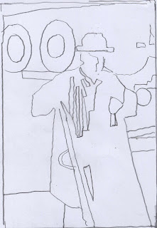
Here is a basic outline of the shapes. Even eliminating the background figure, we are still left with loads of shapes:
Now here is one possible simplification.
and here is another
there are definitely others I could try too. I am using these just to show you how eliminating the fussy background transporter and those huge wheels, gives me much more focus on the porter. But I do not want to "cut him off" from the background......doing that would leave me with the porter as a shape in a vacuum, like a "vignette" floating in the middle of the rectangle. I need to consider working right out to the edges of the rectangle, because in fact, the background is just as important as he is, and needs to be interesting too, even if it is of secondary interest. A painting is about the shapes within the rectangle...ALL the shapes, both subject, and background,so they need to be "knitted together". Therefore, in the first simplification, I have allowed him to melt into darkness, and in the second one, I have allowed the eye to travel from the shape on the left into the figure. I am not entirely happy with either and would do one or two more before embarking on the painting.
Looking more closely at the second one, which appeals to me slightly more than the first because I like the BALANCE of light and dark within the rectangle. I would probably give more emphasis to his head with some suggestion of features, because he is the subject of the painting after all. And I think some darker detail in the head is needed to balance the darkness of the darker shape below. But that would be the main area where I would allow myself the luxury of working on small shapes and I would not embark upon that too quickly.
Sadly, I have no time to produce a finished piece of the porter...instead, here is an image which presented many of the same problems...a figure, and a difficult, unusable background...this model posed in a workshop set-up so the surroundings were simply not usable as they were. Instead, I simplified the colours and "knitted" the figure and background together with a variety of semi-abstract shapes. I did this with the help of a series of thumbnail sketches before I started on the painting.
COLLAGE AS A TEACHER
If you find this whole business of trying to see the shapes, rather than the details, difficult, then Collage always helps enormously. It will shift you from seeing the three dimensional aspects of a subject, to seeing in flat, two dimensional shapes. By rigorously limiting the complexity of forms to flat, plain, simple shapes in paper, you can take a break from worrying about the subtleties and techniques of watercolour, pastels or oils, as there is no "mark-making" involved. If you are someone whose paintings are rather overly "busy" with lots of little shapes, using collage to simplify in an extreme way, will be really refreshing. You will become instantly aware of the relative size and scale of the shapes, and the importance of their interrelationships. I cannot over-emphasise the importance of a strong underlying design for a painting, and the use of collage will teach you SO much about shapes within the rectangle.
I recommend you try painting some sheets of cheap paper in four tones of the same colour, or perhaps three sheets, one light, one medium, and one dark, leaving one sheet white. (Or, if you have them, you could use three different shades of grey paper, and one white.) Then, draw your subject in pencil on another sheet of stiffer paper. Draw just the main shapes.
Then, tear out shapes from your four "tonal" sheets and glue them in the right places over your pencil drawing. This will give you a flat pattern of dark, medium and light shapes. You will be surprised how effective this can be, and how much it will teach you. Even my little 3 minute sketches above have less directness because of the scribbly marks. Time forbids me from doing a collage to you show...but I am sure you can work out what I mean!
.......................
Another way of simplifying your subject is to ZOOM IN, particularly if you work from photos. If you work out of doors, then always carry a viewfinder with you, a small rectangle cut in a piece of card. It will help you to zoom in on one aspect of your scene. That is what I did to create "Blue River" from this photo, the painting is at the top of this post.
apologies - rather long post, I hope you didn't fall asleep before you got to the end!
Jackie.


Very well taught. This puts into words some things I have used, but couldn't verbalize...or explain so well to students!
ReplyDeleteFantastic lesson, Jackie. As Casey said, you put into words many things we are trying to teach our students ... and heck to use myself! I must get my students to try the collage part of your lesson. It may help them understand just how much they must squint to reduce the number of shapes they are seeing. I will be sharing this lesson on Facebook for you!
ReplyDeleteBest tutorial yet among many fine one's. I finally "get" the squinting thing and your blue river is inspiring.
ReplyDeleteThanks so much for sharing.
Richard Jordan
Jackie,
ReplyDeleteyour advices are always pure gold!
Hello Jackie...i've been following your blog for sometime now and have to tell you that they have been extremely informative, and by no means 'too long'....i love the detailed descriptions you give, and the example of the image you created from the photo below tells me so much.
ReplyDeleteMany thanks,
Linda
Hello Jackie...i have been following your blog for sometime now and so appreciate all that you have to offer. this post has been helpful....and is such a good reminder to simplify.....and i have to say i didn't find this post too long at all, i found it so useful - especially seeing the image you created from the photo at the end.....really great words and demonstrations....many thanks,
ReplyDeleteLinda Wright, Cape Breton Island, Nova Scotia (formally from Scotland!!!!)