 |
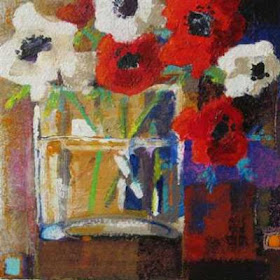
| Roses on a glass table. Pastel on paper |
His picture was, in fact, simply boring. It showed an apple, an orange and lemon on a table top. That was IT. It was quite a good exercise in painting fruits...but it was not a painting.
So I thought I would briefly look at some of the things you can consider , to help towards an interesting painting. It just isn't good enough to plonk a few fruits on a table, and expect it all to look fab just because you decided to paint them.
CHOOSING OBJECTS:
It is always a good idea to keep the objects, and the colours, simple....too many shapes and colours can result in a painting where all the objects are jostling for attention. If you do decide upon a complex arrangement of objects of differing shapes, then it is best to simplify your colour choices, this will give the painting unity immediately. Good still life set-ups do not happen by accident - not even "found" ones, like the leftovers on a table after breakfast, for instance...the painter still has to choose the arrangement from the objects in front of him, he has to "design" his painting.
COMPOSING
I ALWAYS, ALWAYS, advocate the use of thumbnail sketches. I use a little viewfinder, holding it close, or further away, to find interesting compositions. Then, I will do quick thumbnail sketches to see if I like the design within the rectangle, or square. I use tone - usually simplifying into three main tones, dark, medium and light - or perhaps four or five ...light, 2/3 mediums and one dark tone. I do not allow myself to take too long over these little thumbnails, but I always squint like crazy to see the overall arrangement of tones.. Working with tone rather than just outlines means that you are working out the distribution of light and dark AREAS within the rectangle. This is vital. imho.
But you could potentially cut out this step with a couple of modern innovations.
USING A CAMERA
We are SO lucky today; we have the use of digital cameras, and the most useful thing a digital camera can do is instantly show you what a group of objects might look like within the confines of a rectangle. Gone are the days of waiting for your pictures to come back from the chemist! Now we can shoot our scene, and look at the results instantly. So..I am not suggesting you work from the photo - you will always see more with your own eyes, and after all, a still life setup is always vastly bigger than a photo....but the camera can be a most helpful tool to show you a potential composition.
USING THE COMPUTER
Take your pictures, and put them onto your computer. Then you have yet another tool. You can crop your pictures, to make them different shapes, and in so doing, you may well find a new composition you didn't spot before.
CONSIDER THE BACKGROUND
 |
| A "still life" doesn't always have to be objects on a table! |
Think about the kind of impression you want to make on your viewer. Do you want your still life to be dramatic and energetic? Quiet and contemplative? Moody and emotional? Do you want to tell a story? How will you go about achieving any of these aims? Well...you have to think about this. A still life can be just as powerful an image as any other - provided you spend time considering your setup, choosing your objects and colour scheme carefully, and doing more than just putting a few fruits on a table with a bottle of wine and a bit of draped cloth behind.
 |
| you may not like the tipped up perspective on this one....but it was rather fun to paint! It was a bit of an experiment on my part. I am not entirely sure it was successful mind you..... |


Wonderful, Jackie. I have been thinking of going back to doing a few flower paintings, still life ones. You have given me a good amount of things to think about to make them better! As always!
ReplyDelete