I had a bit of correspondence recently with one lovely lady recently, who listened to what I had to say when I pointed out that she was sticking rather rigidly to the photo, and not taking the anatomy of the figure into account at all. The shadows on the figure were destroying the form, and the painting was suffering because she was copying exactly what she saw in the photo, without thinking it through at all. She admitted as much to me, and thanked me for my help, but at the same time, told me that she had received messages of private support from other forum users, who felt that I was being a bit hard on her by even MENTIONING the word "anatomy" and for suggesting that she try certain improvements.
When tackling images of children, it is important to take into account things like anatomy...for instance, a child's head, in relation to its body, is much larger than an adult's head in relation to an adult body. Also, working from a photo, where the child has stared into the camera, and perhaps smiled, will inevitably look rather unnatural, because it is UNTYPICAL. Children rarely sit and stare rigidly at people. Or smile at them incessantly. If caught staring, they usually start to look shifty, or distinctly uncomfortable!
A smiley photo might be fine for the family album, but looking at a smile in a painting becomes uncomfortable after a while, and it absolutely underlines the fact that the image is a copy of a photo - and is therefore likely to be less good than the photo ! it begs the question - why paint the image rather than blow up the photo and frame it?
Once you begin to paint, if you are not a very experienced figure painter, you will soon realise that your lack of knowledge of structure and anatomy is likely to be a hindrance...because the figure is not there for you to check , so you end up slavishly copying the only thing you have - the photo - which is often inadequate. Photos can distort features, flatten colours, and give you exaggerated contrasts of tone. Sunlight can bleach out detail, making faces and hands and other uncovered skin tones, look like plastic. Shadows can meld together, making dark shapes which make no sense if copied rigidly.
My suggestion, if you want to paint kids, and paint from photos...
- take, and choose your photos really well.
- Take more than one shot from different angles.
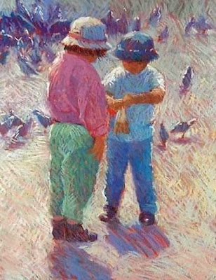
- Kids at play will give you a more animated scene than a staring face and will say lots about their characters too, a scene tells a story.
- Make sure the scene is well lit, light from one side is often best -
- flash straight into a face is an absolute no-no, it is just awful.
If you work from more than one photo, putting a figure into a different background for instance, check the angle and direction of any sunlight very carefully. You need to check proportions carefully too.
If all this sounds like hard work, well, so be it. If you want a good painting, you need to do more than just take out a photo and copy it.
And remember...you do not always need the face to show. None of my images here have faces....yet the parents would recognise their kids in a heartbeat. And there are just as many memories, if not more, in a "scene" as in a portrait. I look at the portrait photos of my children as babies, and they become almost anonymous after a while........whereas the paintings of my kids at play, bring back the moment, and the memory.


Your work is wonderful. What size are the paintings/pastels, you show above?
ReplyDeleteThank you so much. I think the top one was about half a sheet of pastel paper; the centre one is smaller, about 10x8", and the bottom one is an acrylic on canvas, about 14" square. For the top one, I altered the surroundings somewhat...the photo just showed boring grey rocks! The centre one was from a photo taken in St Marks' Square in Venice...LOADS of people in the photo too, all left out; and the bottom one was taken from several photos - in each case, the kids were lined up on the sand, but not in this exact trio.
ReplyDeletetesting replying.
ReplyDelete